Posts

Showing posts from 2014

Nasty Nanny

Image
PREPARATION & PLANNING DEPT: Character doodles before jumping into an animation exercise. China marker on sketchpad, approximately 8.5" x 11"

Modo Matchbox

Image
STUPID SATURDAY PROJECTS DEPT: It occurred to me that I haven't shown much of my 3D work, so I'm putting these up - a still image and animation pair. They were a one-day personal project inspired by a piece of matchbook cover art that I found on the web. I liked it and cooked up this simple model and camera move. I was also testing out how clean a depth-of-field render I could get out of Modo 301. What do you think? Modeled and animated in Modo 301: Sill image 1000 x 563 pixels, movie 600 x 337 pixels @ 24 fps

Halloween Part III

Image
NO TIME FOR ORIGINAL THOUGHTS DEPT: It's that time of year again. Unfortunately, because of health issues I ran out of time to come up with a new poster and instead settled for a slight updating of last year's model. Oh well... Adobe Illustrator, Inkjet print on presentation bond, approximately 18" x 48" Here are the first and second year posters :-)

Something funny, Frank?

Image
SKETCH DAILIES SUBMISSION DEPT: Just a quick paint-over of a Frankenstein monster doodle and having fun with some of Kyle's gouache and watercolor brushes. Franky always looked best to me in black and white :-) Graphite on paper with digital paint-over, aprox. 5" x 6" @ 400 dpi And here's the original sketch:

Jeckyll and Hyde

Image
SKETCH DAILIES SUBMISSION DEPT: Couldn't pass up doing a quick doodle for Sketch Dailies on this subject, despite my bum shoulder :-( China marker on copy paper, aprox. 11" x 8.5" And here's a warm-up sketch I made of Hyde:

More Flipbook Fun

Image
"HAPPY TROT" EXERCISE DEPT: Man– these 4-legged walks and runs are kicking my butt! There's so much to keep track of; watching for arcs; maintaining volumes (or not); and I'm really sucking at overlapping action. I'm through with this one though. It is what it is and I'm having way too much fun to be objective about it :-) 'Also really enjoying using Sketchbook 7 Pro's Flipbook feature for animation. I love that I can customize the workspace to keep it as minimal as I like it. And I hate to say it, but I think I now prefer it over Digicel's Flipbook application. Sketchbook's way of approaching animation just feels more comfortable to me and it definitely has the better drawing tools- hands down. Here's a screen shot of how I like to set up Sketchbook for animation. I like just the bare essentials at hand with nothing extraneous to distract me. I keep the timeline at the bottom, the color picker puck in the upper left, th

Gone to the Dogs

Image
LATE NITE DOODLING DEPT: For some reason I got into a groove last night and kept sketching this dog character. Lord knows why... China marker on copy paper, various sizes

12 Frames of Madness

Image
THINKING I'M BEING CLEVER DEPT: Part of a longer piece, this is a first scribble pass at working out a spastic run for this goofy dog character. I wanted to be clever and throw off the usual rotary run pattern by having the back feet land and push-off together while the left and right front leg contacts are offset from each other. 'Not sure this is working yet, but it's late and I'll look at it with fresh eyes in the morning :-)

A&E Redux

Image
LEARNING NEW TRICKS DEPT: So, the client said "Reprint." and I heard "Take this opportunity to redo those crappy, half thought out illustrations you fostered on me last time around." And so... These are my roughs. I scanned these and then did something completely new to me: I inked them digitally in Photoshop using  Kyle Webster's ULTIMATE Megapack Photoshop brush set.  I love these brushes. Definitely give them a try. Anyway, the quality of my inking is certainly debatable, but the superiority of working this way is undeniable. Inking on multiple layers meant I was free to play with different brushes and effects, and move things around before merging everything down into the final inked drawing. It totally took the stress out of the process for me. I mean, why hadn't I done this before?   I freehanded these little guys directly in Photoshop and was very loose with the inking. I knew that they were going to be repr

SketchBook 7's Flipbook

Image
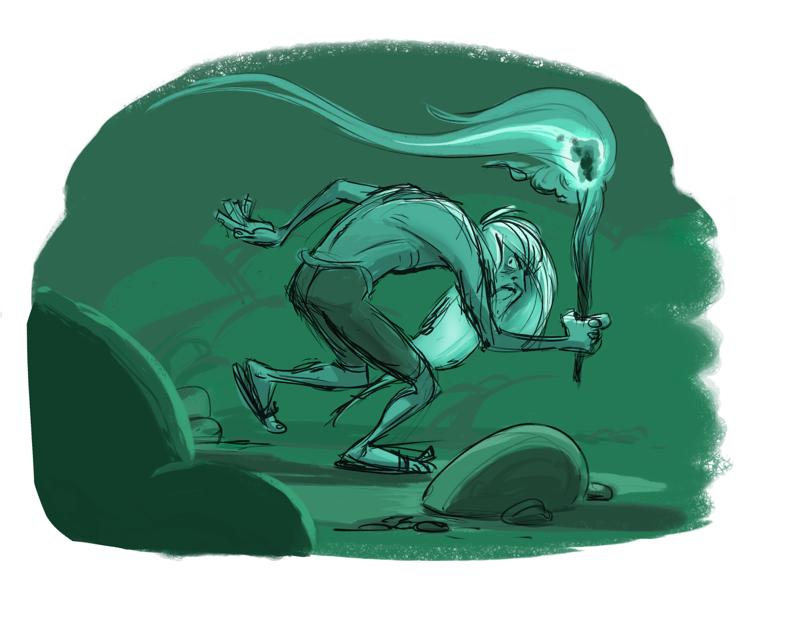
TAKING IT FOR A TEST DRIVE DEPT:  Nothing special here. 'Just a crappy, random scribble test I did to try out Sketchbook 7's new flipbook features. So far, it's feeling like a good fit for me – of course, your mileage may vary depending on your expectations of a 2D animation package. However, at only $24.95 a year for the subscription, it's hard to go too wrong. First impressions? All the essentials are here: a timeline and real-time playback controls; layers, ghosting, and plenty of real-media style drawing tools. It's easy to add, remove, and duplicate frames. There are presets for the common screen formats and sizes (720 and 1080 HD, etc.) and the choice to customize them. Frame rates are also customizable. Drawing keys and timing them is very intuitive, especially if you are familiar with Maya's timeline – which Sketchbook's is very similar to. Even its keyboard shortcuts are the same: hitting the coma and period keys advances you forwards an

BLAM! BLAM! BLAM!

Image
BRAINLESS DOODLING DEPT:  Well, this is pretty self explanatory :D Ballpoint pen on sketchpad, approximately 3" x 3" with digital color.

Good Kitty

Image
NOT A DOG DEPT: Still love my dog, but I'm drawn to sketching kitties lately. Don't know why. Ballpoint pen on 11.6" x 8.6" sketchpad. Above with digital coloring.

More Lunchbag Doodles

Image
"D'OH!" DEPT:  Even with all my formidable photoshop skills, this is the best I could do to extract my sketch from the mess of lines and graphics on this McDonalds bag. Maybe next time I use a clean sheet of paper to draw on? Anyway, this is my submission to the Sketch_Dailey "firedrake" challenge. D'oh! Where's the fire part? Oh well... Ballpoint pen on McDonald's paper bag, approximately 8" x 9"

Snarky Guy

Image
LUNCHTIME DOODLING DEPT: 'Just searching for the right shape to this guy's head. Lots of 'TUDE happening' here :) Ballpoint pen on sketchpad (top 2) and digital #doodles

Phillip Broyles?

Image
LATE NITE DOODLING DEPT: So, I was doodling this other character and not getting it, and not getting it... When suddenly: "HELLO!" this totally different character shows up! I have no idea where he came from. My best guess is that he's a vague cousin of the Phillip Broyles character from the Fringe tv series. Or – he's just some random guy. Here's the scene of the crime :) Sketchpad, 11.65" x 8.45" – above with digital color 4" x 5" @ 100 dpi

Painting Practice

Image
RULE OF TEN THOUSAND DEPT: 9,999 more to go before things start looking better. So, stick around :) Digital, 4.25" x 5"

"He leaped to the waiting flier!"

Image
UNINSPIRED DEPT: I couldn't come up with anything interesting tonight, so I ended up putting a wash over this sketch for fun. Better luck tomorrow, maybe :) Edit: And, hey look! By shear coincidence, my scribbles are lining up with this classical diagonal grid. What dumb compositional luck is that? Ballpoint pen with digital coloring, 9" x 5.7" @ 100 ppi

Floating Ships

Image
E.R.B. MEMORIES DEPT: I've had these blimp-like floating ships on my mind lately. No doubt I'm being influence by some old memories of a John Carter of Mars story I read as a kid - one of the later books, I think. I really liked them because, as stories go, they were more exotic-pirate-movie-adventure than straight science fiction. There's also a bit of Jaba's barge in there as well (from ROTJ). Funny what influences creep into our stuff when we're not looking. Anyways, I kind of like these doodles :) Ballpoint pen on sketchpad, 11" x 8.5"

The Mummy Returns?

Image
MAD MONSTER MASH-UP DEPT: Hmmm- the more I draw this character, with those tattered bandages, hunched back, and shredded poncho, the more he's starting to resemble a mash-up between Universal's The Mummy, Frankenstein's Igor, and Sergio Leone's Man with No Name :) Anyway, here's another sketchbook page… Blue ballpoint pen on 11.5" x 8.5" sketchpad, above with digital coloring.

Mad About Morty D.

Image
FAN ART DEPT: Every once in a while, you've just got to break out some vintage Mort Drucker and start sketching! These are from June, 2001. Black prisma color pencil on marker paper, 13.75" x 16.5

Son of Ben Gunn

Image
EARLY AURAL IMPRESSIONS DEPT: When I was eight years old I heard Walt Disney's "Treasure Island" for the very first time. That's right, I said "heard," not "saw." You see, one rainy Saturday when my brother and I were visiting my Grandmother, she played for us a 4-disc, 78 rpm recording of the movie's soundtrack that she had bought for our father when he was eight. AND MAN!!! I can't tell you how vividly these records played in my young mind! The voices! The sound effects! The music! They all mixed together in my child-sized brain to paint a picture of every exotic location and every larger-than-life character. And the character that left the biggest impression on me was poor old  Ben Gunn , the pirate who had been stranded on the island of the title years before, left to die by that dirty Long John Silver and his mates, and who (spoiler alert here!) secretly squirreled away the entire buried treasure – as something to do on his

It's Oscar Time!

Image
"ISN'T IT TIME YET?" DEPT: I just can't wait until tomorrow night's Oscar show! Yeah– I'm a real Academy Awards junky. I haven't missed one since 1974! To help myself cope with the wait, I dashed off these doodles of Ellen Degeneres, this year's host. I wish I could do her more justice, but my skills are failing me tonight. As far as I'm concerned, Ellen is right up there with Johnny Carson and Billy Crystal as the all-time best hosts of the ceremony and I'm looking forward to a thoroughly enjoyable (and long) Sunday evening :) Digital, 11.5 x 8.0 @ 300 dpi.

Sharing the Sonship Dream!

Image
"BUT, WHAT I REALLY WANT TO DO IS DIRECT" DEPT: In the early 1980s I was lucky enough to be part of a group effort to develop and sell a television series titled "SONSHIP." We went so far as to shoot a trailer to show investors, but nothing ever came of it. A few years later, the concept and storyline morphed into a feature film and I was asked to visualize characters and other art direction aspects. Three of my concept boards are shown here. The first one visualizes some of the bad guys; the second shows two of the good guys - including the lead character; and the third shows the two young protagonists, who at this point in the story don native disguises to elude their pursuers. When I look at these drawings today, I'm struck by two things: 1) although you may not see it, I really see the influence of illustrator Jean Moebius in my line work. I had just discovered him and was really taken with his loose style and incredible imagination. And 2) I see how

Almond Butter

Image
MAKE IT UP AS YOU GO ALONG DEPT: Thanks to some very kind people who overlooked my lack of talent, my inexperience, and yet were still willing to pay me money, I had a minor career as a production designer back in the mid 80s. These were all local commercials and industrial films, but I had a blast designing props and sets for them all. Being a huge movie fan, I was able to offset what I didn't know with extreme enthusiasm for the work. And I had the good fortune to work with an excellent set builder, Steve Hoyland. He had the patience of a saint and treated me well. The drawing above was a set for one of the local television commercials I was hired for. Actually, Steve had gotten the job (from director Grant Spot - yes, that is his real name) and he hired me to draw up some set concepts. This commercial was hawking a new product, Blue Diamond Almonds' Almond Butter - which was just like peanut butter, but made with almonds. Grant and Steve needed two sets: one (shown

A view of the Lake

Image
MORE "MORE OLD CRAP" DEPT: I designed and illustrated this brochure cover for one of DWR's visitor centers some time in the mid 90s. The assignment wasn't necessarily supposed to be an illustrative one. I could have used a nice photograph if I'd wanted to. But one was not available because, as the axiom goes, "To take a picture of a pretty girl, the first thing you need is a pretty girl." And the exterior of this visitor center was not "a pretty girl." The grounds surrounding its front were barren and dominated by a large expanse of grey, cracking asphalt, meant for the herd of visitor's parked cars they must have been expecting. However, the center has a great view of the lake behind it. After all, the name of the center is Vista Del Lago! So I chose to illustrate that aspect, designing a simple, almost mark-like, graphic that played-up that view. It's composed as if the center and lake were seen through a telephoto lens, stack